Web Design that Takes Advantage of the Reader Habits
F shaped reader patterns
In today’s web design, many of us would look at dozens of pages of information every day without giving much thought to the process that we use to read them. In fact, because it is such a familiar activity, we follow very distinct patterns of behavior as we scan over the information on a web page, and a savvy online presence will take advantage of those reading habits.
It used to be the golden rule of web design that users were unlikely to click on a website more than three times to find the information that they were looking for, but recent studies have shown that this is no longer true. We have become more used to navigating through websites and the number of clicks is less important than the ease with which buttons can be operated. The same sort of mentality holds true for the written content and how much of the page the reader has to scroll through in order to get to what they are looking for. Experienced Internet users will scroll down past the fold, and while good small business web design will still use the space above the fold (the amount that is displayed in the first screen of a website) effectively, it is no longer a hard and fast rule that this is the only valuable space on the layout of a web design.

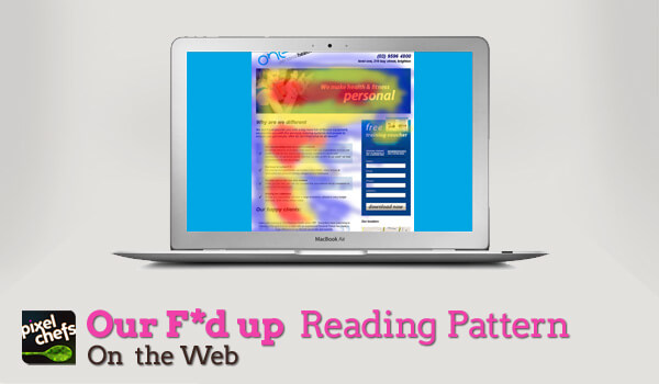
Perhaps the element of web page dynamics that has received the most attention recently is the F-pattern that readers follow when they are scanning the content of a website. Web design Eye tracking experiments have shown that readers scan pages more intently in areas where they have become accustomed to finding the most valuable information. This pattern is shaped like a capital F and shows that readers first concentrate on the header of a page and then skip down the left side of the page, pausing to take in any subheadings that have been used in the copy. These studies have also shown that web page readers almost ignore anything that is in the right hand column of a website where the banner and CPC ads are usually placed, while the area that gets the most concentrated attention is the left side of the page. Images also get more attention than text, at least initially, and using eye catching words or images on this side of the page will encourage readers to scan across the page more closely at that point.
Effective small business web design requires the skillful handling of a number of details to create pages that are not only attractive, but are also informative and engaging for readers at the same time. Placing images, calls to action and important hyperlinks in places where readers will be the most likely to see and use them is vital. One of the techniques that all web designers can employ is to tailor their layouts to be as reader friendly as possible, which will increase the instant legibility of the web page and make it more likely that you will get your marketing message across.
I design beautiful websites, incorporate the latest technical SEO and impactful storytelling to create digital products that help our clients succeed online.
View all posts by Alex Alexakis


